Friday, 30 March 2012
Berkay Soyer,
Fahmida Chowdhury,
Hannah Dang,
Rebecca Chance
0
comments
Catechize
In what wats dies your media product use, develop or challenge forms and conventions of real media product?
Question 1 on Prezi
In what ways does your media product us, develop or challenge forms of real media products?
Question 1 on Prezi
How does your media product represent particular social groups?
Representation: The way media constructs the identity of either the person or a collective group.
Throughout the opening of my thriller 'Catechize', social groups have been explored. Firstly as all pictures of victims are female, we clearly get an insight of the typical representation of gender when talking about females. In many thrillers, females are seen as the most vulnerable subject, therefore they mainly play the role as the 'victim'. By using these photos, I feel as if we have copied the typical stereotype rather than challenging it. This is effective as when focusing on audience, they automatically know what to expect, as their minds are already telling them "a female is about to get victimized". All in All it is fair to say that throughout females have been portrayed in a negative way.
Again, still focusing on females, through mise en scene we see another stereotype, as women being portrayed as provocative sexual objects. In the picture, the girl is wearing bright red lipstick and a plain white vest top. Red symbolizing intense passion, aggression, and courage as well as sexual impulses in comparison to the white vest top symbolizing purity and cleanliness, shows how innocence can be portrayed in conjunction to lust.
What have you learnt about technologies from the process of constructing this product?
GoAnimate.com: Technologies I have used in my sequence by Rebecca Roberta
Like it? Create your own at GoAnimate.com. It's free and fun!
GoAnimate.com: Technologies I have used in my sequence by Rebecca Roberta
Like it? Create your own at GoAnimate.com. It's free and fun!
What have you learnt about technologies from the process of constructing this product ?
GoAnimate.com: question 6 by Berkay
Like it? Create your own at GoAnimate.com. It's free and fun!
GoAnimate.com: question 6 by Berkay
Like it? Create your own at GoAnimate.com. It's free and fun!
Friday, 9 March 2012
Berkay Soyer,
Fahmida Chowdhury,
Hannah Dang,
Rebecca Chance
0
comments
Group 38.. everything up until now
During our time creating our thriller film opening, we learnt to be very careful when saving and ejecting the video drive. In order for our work to be saved, we had to save everything onto our group's video drive so we could use it again in future.
If we did not do so, we would not have any saved work or projects. Also, we had to remember to eject our video drive, failing to do so could result in everything being deleted.
If we did not do so, we would not have any saved work or projects. Also, we had to remember to eject our video drive, failing to do so could result in everything being deleted.
Rather than using an existing soundtrack, as a group, we used Soundtrack Pro to create our soundtrack which would play throughout our film opening.
 |
| Before making the actual soundtrack to our final opening, we began playing around with Soundtrack Pro to familiarise ourselves with it. |
 |
| Getting used to Soundtrack Pro, listening to what the programme has to offer. |
 |
| In the the process of creating the logo. |
Every film company, production company has their own company ident, which is included in the beginning of a film. Using Photoshop CS5 I have created an ident, which represent us and will be included in the beginning of our film, along with 'C&I studio'
 |
| Final logo. |
Saturday, 3 March 2012
Berkay Soyer,
Fahmida Chowdhury,
Hannah Dang,
Rebecca Chance
0
comments
Choosing the name of our opening
 |
| We used dafont.com to choose our font. |
 |
| We then downloaded it onto the macs and from there, we imported it into Final Cut Pro and used it for our titles. |
 |
| Screenshot of the film opening and where 'Catechize' has been placed. |
Berkay Soyer,
Fahmida Chowdhury,
Hannah Dang,
Rebecca Chance
0
comments
YouTube tutorial: How to add text on Final Cut Pro
We watched a number of video tutorials to recap how to do certain things on Final Cut Pro. For instance, putting text on top of our footage on Final Cut. We used the following tutorial as it was very basic and easy to understand, we also wanted our titles on TOP of the film and this allowed us to do so.
Mary Berrisford (our media teacher) gave us some very useful feedback and criticisms on our rough cut of the opening.
Things that needed changing:
- The name of our film opening
- The overall length of the opening
- The black material where the Polaroid photos are placed
- The length of the final lift scene
We edited all of these things and think the criticisms made our opening better, more concise and more understandable. The several extreme closeups made our opening seem very intricate and difficult (which it was).
Friday, 2 March 2012
Berkay Soyer,
Fahmida Chowdhury,
Hannah Dang,
Rebecca Chance
0
comments
ROUGH CUT
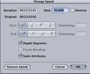
We used Final Cut Pro to edit our thriller opening sequence. Using this, we learnt how to do a number of things like changing the speed of the our footage. This was essential as we wanted a fast pace sequence and the original footage was too slow.
 |
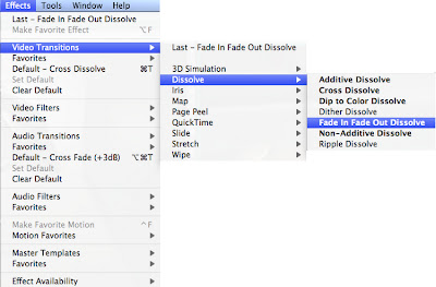
We added a number of effects to our opening, we learnt how to edit our videos and add transitions. For example, adding dissolves (fade in/fade out or both).
 |
| Adding different effects on our footage on Final Cut Pro. |
Saturday, 18 February 2012
Berkay Soyer,
Fahmida Chowdhury,
Hannah Dang,
Rebecca Chance
0
comments
Target Audience
Friday, 17 February 2012
Berkay Soyer,
Fahmida Chowdhury,
Hannah Dang,
Rebecca Chance
0
comments
Shooting Day 2!
 |
| The overall look. Our main character covered in bruises (done by Rebecca) wearing a simple white top |
 |
| Slightly bruised and bloody |
 |
| We learnt how to make bruises using tutorials on YouTube |
 |
| Battered and bruised |
 |
| Rebecca filling the container with water |
Our second location to film was Rebecca's house. Today we filmed David Dench (Berkay) being dunked into the 'ice-cold' water bowl. We also record some close up of props.
Wednesday, 15 February 2012
Berkay Soyer,
Fahmida Chowdhury,
Rebecca Chance
0
comments
Preparing to film
In order to create realistic bruises, we researched on YouTube and watched other videos of makeup artists and many others creating bruises using makeup.
Wednesday, 8 February 2012
Berkay Soyer,
Fahmida Chowdhury,
Hannah Dang,
Rebecca Chance
0
comments
Shooting Day 1!
8/2/2012.
Today was our first day of shooting!! Our first location was the photography studio where we shoot the flashback scenes! We manage to shoot 2/3 of the flashback scenes in 1 and a half hour. Everything went smoothly!
Today was our first day of shooting!! Our first location was the photography studio where we shoot the flashback scenes! We manage to shoot 2/3 of the flashback scenes in 1 and a half hour. Everything went smoothly!
 |
| Rebecca doing Dench's victims makeup! |
 |
| Berkay using a magnifying glass over some important documents. |
In the process of shooting our extreme close up shots of Dench's flashback, the shots are inspired by Se7en's opening sequence.
 |
| The list of women names. |
 |
| Hannah in role as a victim, while Rebecca takes a polaroid photo of the victim. |
Berkay Soyer,
Fahmida Chowdhury,
Hannah Dang,
Rebecca Chance
0
comments
Planning - Polaroid Pictures.
 |
| Series of photos of Dench's Victims. |
These of the polaroid photos we took in the photography studios that will be used as a prop in our filming today. The photos are victim David Dench has killed.
The first picture depicts one of many Dench's victims, if you can see clearly she has bruises on her neck and her left eyes is also swollen, thanks to our very own make-up artist Rebecca for adding to the effects!
Berkay Soyer,
Fahmida Chowdhury,
Hannah Dang,
Rebecca Chance
0
comments
Planning - Production Schedule
Our production schedule of the weeks to follow. We learnt that planning our schedule was essential and the schedule allows us to keep on top of what we needed as well as what we planned to do that day.
The two title sequences that I thought was influential and relates to our very own title sequences are Se7en (1995), Die Another Day (2002) and The Stepfather (2009).
 |
| Allure storyboard Se7en (1995) |
 |
| Allure Storyboard Opening sequences of Die Another Day, torture scenes. |
As for the torture screen, Die Another Day has given us a few ideas in how to shoot the torture screen, what the atmosphere of the room should be like and what camera angles work best.
As for The Stepfather (2009) we will follow their order of credits.
 |
| The Stepfather opening. |

We also like the font in which The Stepfather uses, the font is a simple san serif font that clearly states the credits names and do not distract the film content. Fancy and over the top fonts will looks unprofessional and childish.
Tuesday, 7 February 2012
Berkay Soyer,
Fahmida Chowdhury,
Hannah Dang,
Rebecca Chance
0
comments
Planning - Storyboard and Animatic.
Subscribe to:
Comments (Atom)


- Follow Us on Twitter!
- "Join Us on Facebook!
- RSS
Contact